

Yesterday, I spent most of my time defining the MVP: what this product needs to be, and just as importantly, what it does not need to be. That MVP became my North Star for the entire build.
Today, my main focus was planning the implementation: defining the main flows, the core roles, their needs, and how everything should connect. I made a conscious effort to avoid adding features that were not part of the original MVP, even though, with vibe-coding, adding “just one more thing” can be very tempting. Keeping focus was not always easy, but overall, I stayed on track.
Starting with roles and flows
One of the first things I did was clearly define the main roles and the primary flow of the product. That decision defined everything that came after, including how the screens were planned.
In Trusted Circle, there are two main roles:
- Seekers: people who are looking for help
- Helpers: people who offer help
For seekers, I identified four main areas of help that are especially common when someone arrives in a new city:
- Child care
- Pet care
- Home cleaning
- Home help (from home sitting to small repairs or daily tasks)
Once the roles and use cases were clear, the next question was: which role should drive the product design?
I realized that the experience should primarily be built around seekers. Why? Because they are the main creators of the layers of trust. A seeker recommends a helper to other seekers. That’s how trust is built.
Designing the seeker-first experience
Both seekers and helpers can access the landing page, but the main call to action is clearly focused on seekers: “Explore Trusted Helpers.”
From there, seekers can:
- Browse available helpers
- Filter by type of help (child care, pet care, home cleaning, home help)
- Filter by language
Language turned out to be especially important. From the survey responses, it became clear that people feel more comfortable when they can communicate in their native language or in a language both sides speak well, so I decided to build a specific filter for this.
At this stage, the goal is to let curious users explore the app without having to register. I wanted people to be able to learn about the app without any additional effort. Sensitive information is not exposed at this point yet. For example, instead of showing who recommended a helper, the app just says “recommended by 3 people.” This gives context without breaking privacy.

Seekers can also open helper profiles to see:
- Types of help offered
- Experience highlights
- General background information

To access more detailed information, users need to sign up.
Sign-up and profile creation
During sign-up, users are asked for:
- Email address
- Phone number (important to allow users find them on the platform and ask for introductions or recommendations. Phone numbers are never exposed.)

- And the type of help they’re looking for
They can also select tags that describe their current situation, such as:
- Expat
- New in the city
- Parent / single parent
- Pet owner
- Freelancer or self-employed
- Recently had a baby or adopted a pet
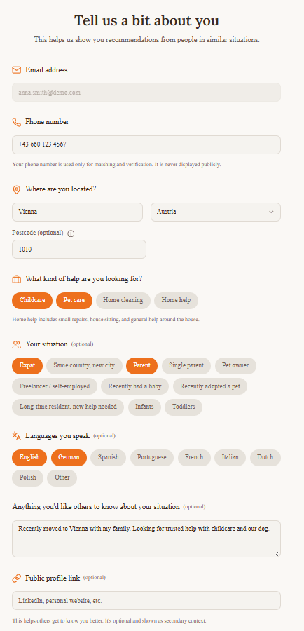
The idea behind these tags is simple: we tend to trust people who are similar to us, and the app will use this information to help seekers see what they have in common with each other and what they have in common with helpers.
There is also a free-text field where users can share anything they want others to know about their situation. This information can later be used to improve matching through keywords.
Users can optionally add a public profile link (for example, LinkedIn). This applies to both seekers and helpers and adds another layer of transparency. If provided, seekers could see which type of content helpers share on social media and eventually learn more about their hobbies and personality.
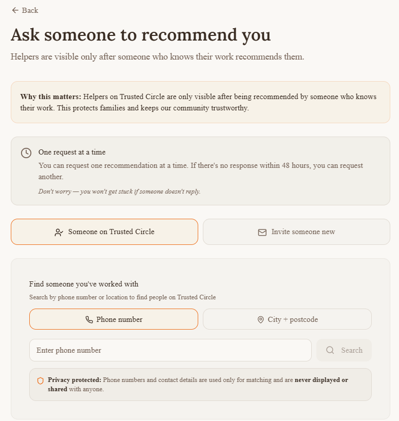
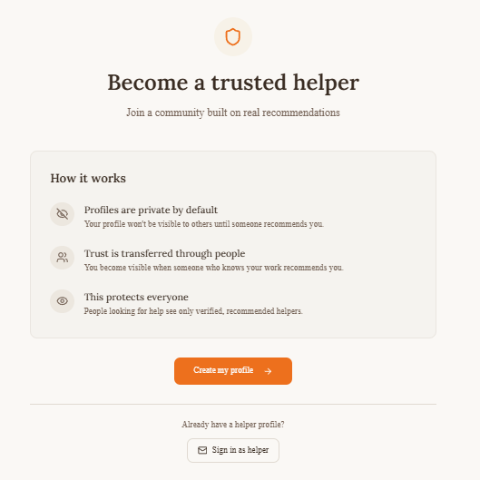
Helpers have their own registration flow. They need to also enter information about availability and experience. Additionally, their profile needs to be first approved by a person who has already worked with them in order to become visible (validation = trust).

A practical demo decision
In a real product, users would confirm their email via a validation link. For the demo, sending and showing confirmation emails would add unnecessary complexity.
Instead, I added a simple button: “I have confirmed my email (demo)”, which allows users to move forward and explore the app. It’s a pragmatic solution that keeps the demo actionable while still reflecting the real flow.
Building trust through introductions
Once registered, seekers can:
- View full helper profiles
- Recommend helpers they have worked with before
Recommendations are central to how trust is built in Trusted Circle. Seekers don’t contact helpers directly. Instead, they request an introduction through another seeker who already knows the helper.

When a seeker clicks “Request an introduction”, they:
- Select what type of help they need
- Write a message to the seeker who recommended the helper
For example:
“Hi Ana, I saw you worked with María Santos before. Would you feel comfortable introducing us?”
The recommending seeker can then decide whether the are a good match and introduce them. If they accept, a private chat opens.
This extra step adds friction intentionally. It creates an additional layer of validation and helps ensure that trust is built through people, not just profiles. The first move comes always from the seekers, and the contact is made only after another seeker “introduces” the two.
Additional Trust Layers
At this point, the person looking for help has already:
- Viewed the helper profile (which had to be validated by someone else)
- See what they have in common
- Checked the recommendations made by other members of the community and eventually any concerns raised, as well as the helper’s response to these concerns

Now they can start chatting directly with the helper and ask them for more information to get to know each other:
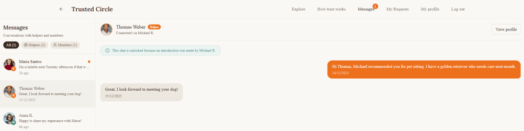
Note: Chats between seekers are also supported.
As next steps, the seeker can suggest a video call and, after that, meeting in person in a public place.
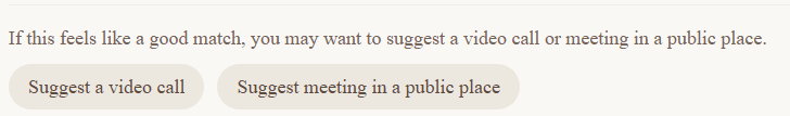
Without even noticing, this person becomes less of a stranger, and you have more reasons to decide whether you trust them.
Incentivising recommendations
After defining the main flows, I spent time thinking about incentives.
Trusted Circle only works if seekers actively recommend helpers. So the question was: why would someone take the time to recommend a helper?
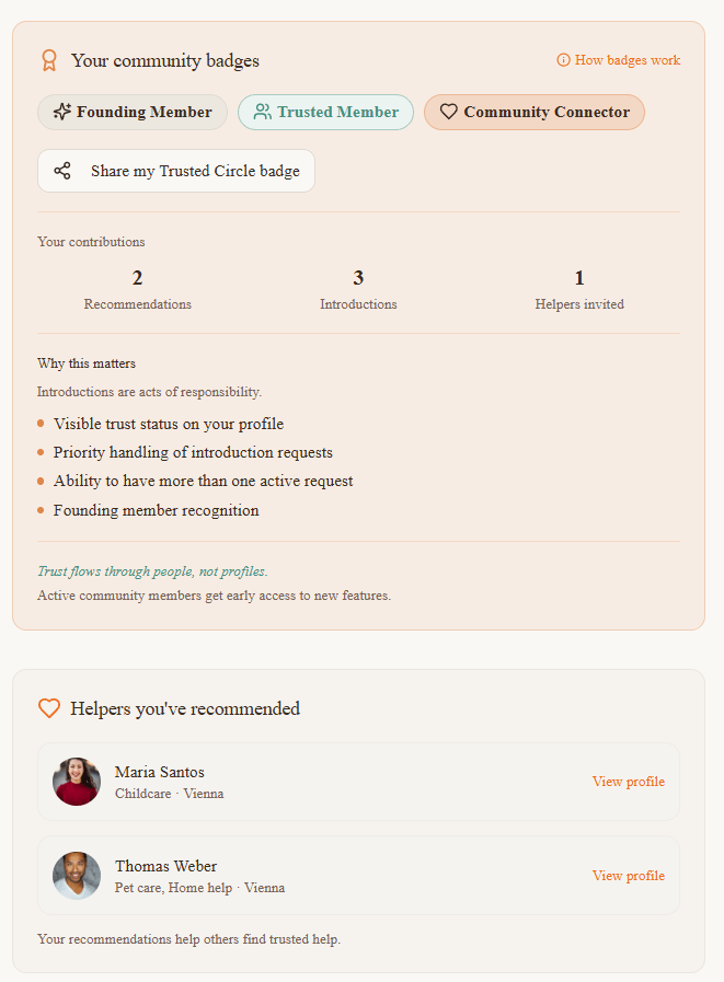
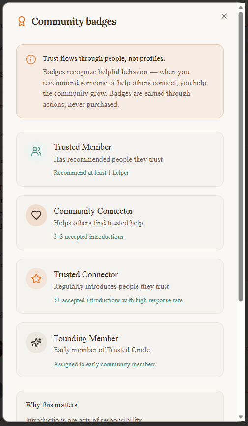
I explored a few incentive mechanisms, and landed on a badge-based system with three goals:
- Make contribution visible inside the community
- Encourage positive behaviour through recognition
- Unlock benefits for the most active members
Seekers can earn badges based on how much they contribute to the community by recommending helpers. These badges serve two purposes. Inside the app, they help show that someone is an active and trusted member of the network. Outside the app, they can be shared on social media as a way to show participation in building trust-based communities.
In addition, higher levels of contribution unlock practical benefits, such as:
- Preferential access to certain features
- Earlier or easier access when requesting introductions to helpers
The idea is simple: contributing to trust will pay off.
Monetization
From the beginning, I was very intentional about how Trusted Circle could be monetized in the future. Because trust is the core of the product, monetization cannot interfere with who appears in the network or how recommendations work.
That’s why Trusted Circle is designed so that no one ever pays to be trusted. Helpers can never pay to appear in search results or to receive recommendations. Visibility always comes from real people vouching for them.
Instead, the monetization model focuses on secondary support, once trust already exists.
First, there is a model for companies and relocation agencies. These organizations often support employees who are new in a city and struggle with exactly the same problems: finding childcare, pet care, or home help they can trust. Trusted Circle could offer them an upgraded service that helps their teams access trusted local networks through real recommendations, rather than open listings or anonymous platforms.
Second, there is an upgraded seeker membership. This is entirely optional and designed for people who want more flexibility once they are already part of the network. This could include extra filters, the ability to request more introductions at the same time, or faster access to trusted recommendations. The core experience remains free and usable without upgrading.
Third, there is an upgraded helper profile boost. Helpers never pay to join Trusted Circle. They only become visible after being recommended. Once they are already trusted, they may choose to boost their profile to increase visibility within the network. This is positioned as a visibility option, not a trust shortcut.
Across all three options, the key principle stays the same: trust is earned, not bought. Monetization supports the ecosystem, but it never replaces or weakens the recommendation-based model that makes Trusted Circle work in the first place.

A Word on Accessibility
Accessibility was considered from the start, not added at the end. While building Trusted Circle, I paid attention to contrast, typography, spacing, and interaction patterns to make sure the interface remains readable and usable for as many people as possible.
The design follows core WCAG principles, focusing on sufficient color contrast, clear visual hierarchy, readable font sizes, and predictable navigation. Interactive elements are clearly distinguishable, and flows are designed to reduce cognitive load rather than rush users into decisions.
This matters especially in a product like Trusted Circle, where people are already under emotional stress. Accessibility here is not only about compliance, but about creating a calm, understandable experience that helps users feel safe and in control.


Leave a comment